In three years, smartphone traffic has increased by nearly 90%. According to a recent study, in 2019, global Internet traffic via computers accounted for 46% of the total, compared to 54% for mobile devices.
The observation is clear, even if the navigation on Desktop is still very present, it does not stop decreasing. So the question is no longer “Should I have a responsive site? “, but rather “When will I invest in a responsive site? ”
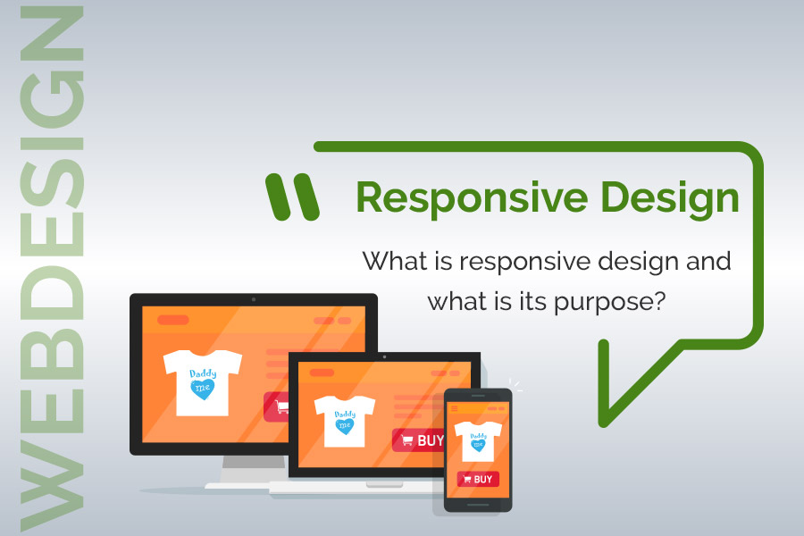
Responsive Design : definition
The responsive design or adaptive website allows a website to offer mobile users a pleasant navigation on both computers and smartphones. Each block and image is resized according to the screen resolution.
Responsive Design improves the user experience, especially when reading on a smartphone or tablet.
Unlike a site that has not been adapted, a responsive site will be mobile friendly, the user will not need to zoom in or out to read the texts and see the images, the menu will be clearly accessible, the navigation will be simplified and the fields to be filled in the forms and emails will be adapted to be easily filled.
Responsive design site Vs dedicated to mobile phones site ?
A few years ago, most websites had a version specially designed to be visited on mobile phones. Its advantage was a faster loading of the pages. The only problem was that some functions could be missing.
However, some companies still have a dedicated mobile site in addition to their responsive site. It is an effective option that allows Internet users to save data and access their content more quickly. However, when you say two sites, you mean twice as much work.
What are the advantages of responsive design?
Even if the development of a responsive design site is more complex, it has many advantages:
- An identical URL on Desktop and mobile.
- Automatic adjustment of text blocks and images according to screen resolution.
- A better natural referencing, because all traffic arrives at the same place and Google favors pages adapted for mobile reading.
- A lower bounce rate than on a non-responsive site (so more pages viewed per visit).
How to recognize a responsive website?
A responsive site will keep the same design if you reduce the size of your screen window. If it is not, you will need to use a scroll bar to see the entire page content.
On smartphones, if the reading is clear as soon as you arrive on the site, it means that the site is responsive. If the use of zoom or horizontal scrolling of the page is necessary, it is because the site is not responsive Design.


